Juried Awards

A special thank you to our juror, Martin Hooper
Martin Hooper is a founding partner and the creative director at Drift. His aesthetic was shaped by growing up surrounded by the vintage hand painted signage that still exists in East Texas. He got his start working for a print shop in high school. He fell in love with screen printed posters, became obsessed with design, and hasn’t looked back since. Over the span of his career he’s helped shape hundreds of brands, but still loves the challenge of crafting something unique everyday. A graduate of Texas A&M University, College Station, TX was a natural place for him to put down roots. He likes sweater weather, golf, and watching football. His mother tells him he’s a blast to hang out with. His philosophy is that design is an organic, team-driven process, and believes that great design should feel truly timeless. driftingcreatives.com
Best of show
Best overall portfolio
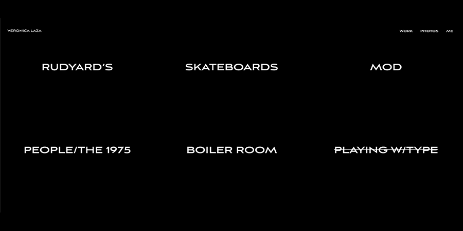
Veronica Laza

"Really love the simple and clean website. There is a strong style present across all of the projects, but each one feels like it really fits with the brand. I also liked that while there was a strong style, Veronica was able to showcase a number of different skills. From custom type to strong UI/UX work this portfolio made a great impression."
Best Corporate Identity
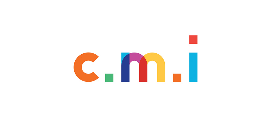
CMI
Chelsea Miller

"Love the clean branding that also feels fun and childlike. I think this is a perfect brand for the prompt, and the digital examples really help to show the brands personality. The example of the custom font being used for “cool kids” shows that the brand is versatile and could be deployed easily."
Best Hospitality Branding
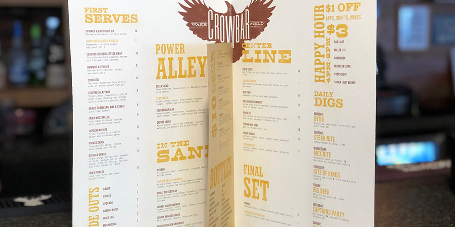
Wakefield Crowbar
Ashley Defrancis

"I like the logo, but I love the way Ashley used vintage typography throughout this brand. It feels polished and well thought out, I can see the typography easily translating to interior signage and advertising. I also appreciate the attention to detail with the texturing. Instead of using a textured font, each piece is textured which really adds a real vintage feel to the brand."
Best Badass Brand
Rudyard’s
Veronica Laza

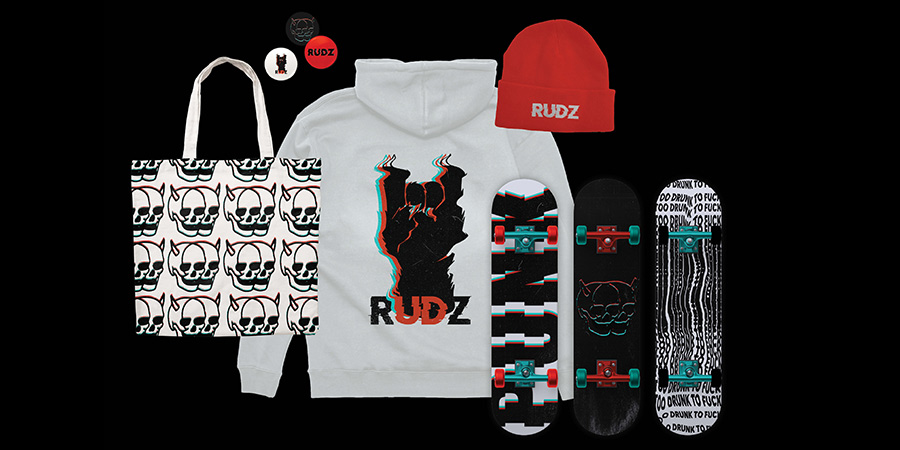
"I loved this project so much I had to create a category for it. I don’t know if Rudyard’s exists, but I want to go there as soon as possible. Somehow there is a mix of typographic styles and illustration styles all working perfectly together. This branding is bold and breaks rules in the right way, it would be a hard sell for a corporate client but feels perfect for a local dive / punk bar."
Best Concept
Diversity
Amber Pasquarelli
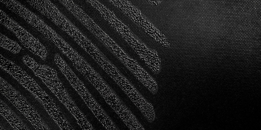
"I love the concept behind diversity and a fingerprint. Our fingerprints are all unique and diverse, but also a reminder that regardless of our differences we’re the same."
Best Style Guide
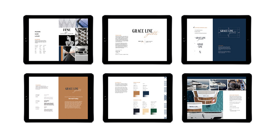
Grace Line Yachts
Audrey Humphreys

"The brand guidelines for Grace Line Yachts is comprehensive and well laid out. You’re really able to get a sense of the brand as a whole, and I think any agency that worked off this brand guide would be able to keep the brand visuals consistent."
Best Packaging
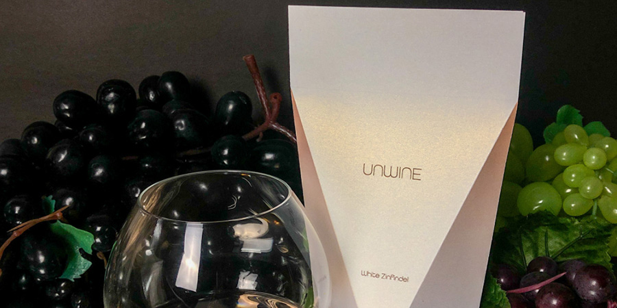
Unwine
Chelsea Miller

"I love how clean this packaging is, and I love that it is a unique way to package the product. The hints of color to differentiate types of wine is a nice touch."
Best Publication
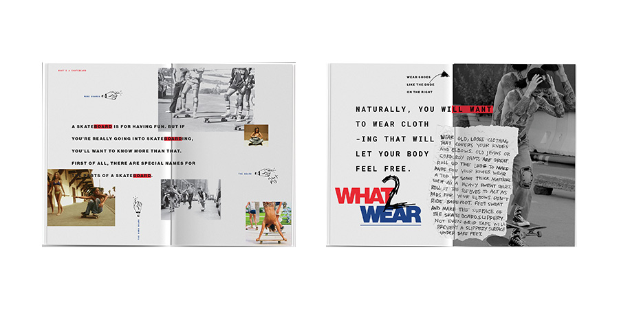
Skateboards
Veronica Laza

"This book not only is a great guide, but does a good job of capturing the skateboard culture throughout the decades. The illustrations compliment the photography and type selections. I also love the flavor text and personality that oozes out of this piece."
Best Publication Honorable Mentions:
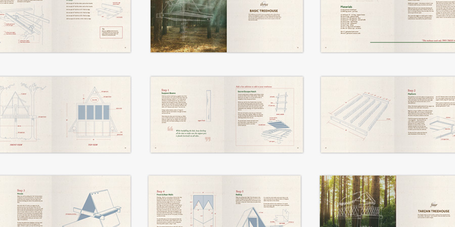
Treehouses
Audrey Humphreys

"This piece is great, I love the style and the single lineweight illustrations over the photography."
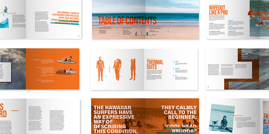
Surf
Jacob Magby

"The mix of handmade and clean typography is great! Gives off the perfect vibe for a surf book, and is a great example of mixing styles in a successful way."
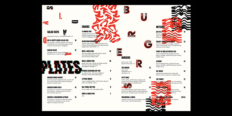
Best Menu
Rudyard’s
Veronica Laza

"This menu is bold, and a great fit for the brand as a whole. It’s also really well organized and easy to read while also being visually interesting."
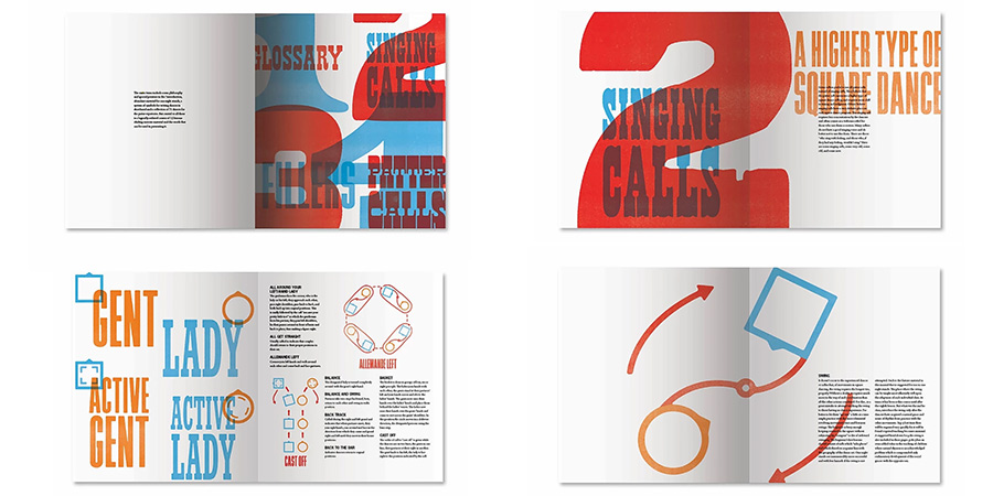
Best Use of Type
Square Dance
Ashley Defrancis

"The typography in this piece is a perfect fit for the subject, but is used in a really interesting way. The texturing and overlays are perfect and they really add a lot of personality to the piece. Even though a lot of different typefaces are used they all blend together really nicely."
Best Use of Photography
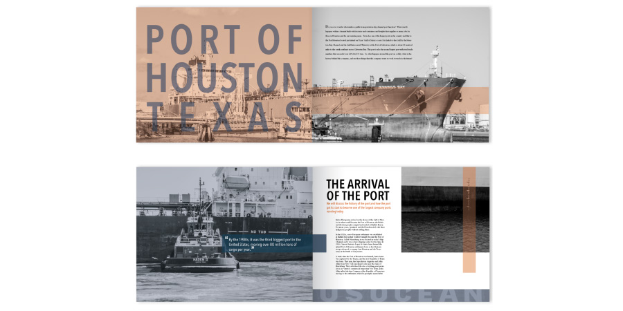
Port of Houston
Audrey Humphreys

"Love the photographs and the treatment used on the photos. They work really well with the book and were used in a number of interesting layouts."
Best Use of Illustration
How To Build a Treehouse
Audrey Humphreys

"These single lineweight illustrations are used perfectly over the photographs. Also the lumber and wood illustrations are fantastic. The illustration are also very informative and would be helpful when using the guide."
Best Logo
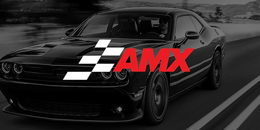
American Motors
Quincy Webster

"I think the logo using a finish line as the mark is a great touch and works well as a standalone. The typography and colors also translate really well across the entire brand."
Best Custom Lettering
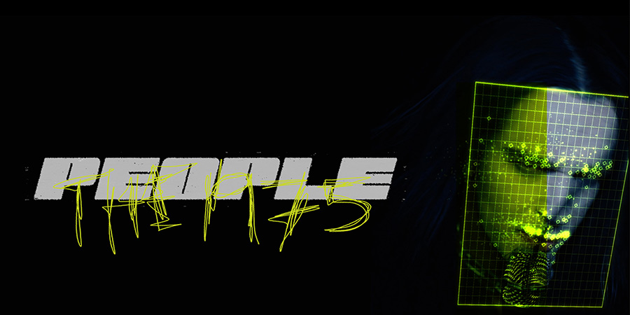
The People
Veronica Laza

"I think this custom lettering is a great representation of the artist's current vibe and the track. Love the subtle texturing and the hand scribbled type. It feels really polished and very on trend for the post punk market."
Best Website Work
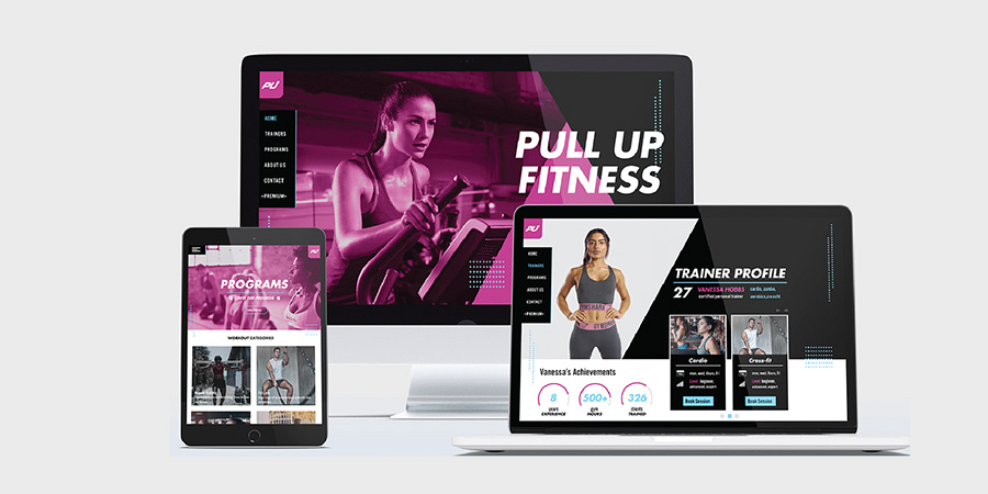
Pull Up Fitness
Quincy Webster

"Strong work. Has a great brand feel and would be memorable for potential customers. Overall I think this close to something our studio would launch. The body typography and titles need a little bit of work, but overall it is a great design."
Best App Design
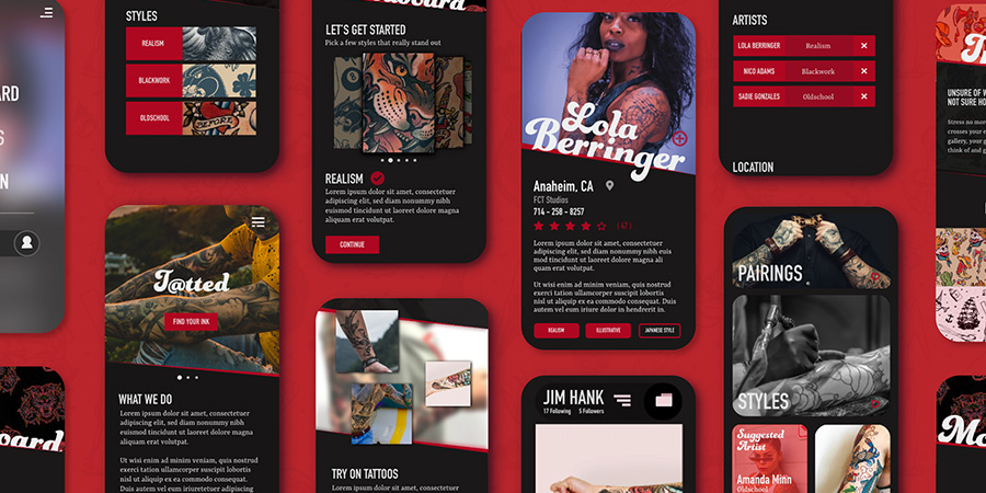
T@tted
Jacob Magby

"With limited screen space, it can be really hard to design an app that relies on photography. I think this app design does a great job of maximizing the space for photos, while still feeling on brand and easy to use."
Best Poster Design
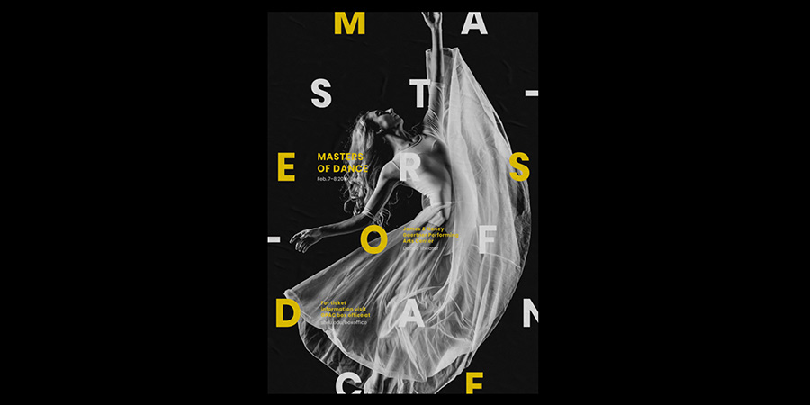
Masters of dance
Veronica Laza

"This poster is not only bold enough to capture your attention, but it is easy to find and read the important information. I would have pulled the whites down a bit further in the background image to really increase legibility, but that is a small tweak."
Best Social
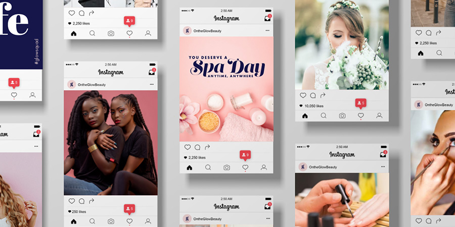
On The Glow
Ashley Defrancis

"These social examples are great, and I think a perfect execution of the brand. Even from this small snapshot, with the rest of the brand imagery I could build out a social campaign."
Best Book Cover
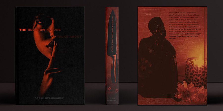
Religion
Chelsea Miller

"The limited use of color, typography, and photography all play together really well. The knife on the spine and the overall vibe of the design give the customer a great impression of what kind of book this is."
Congratulations from your proffessors
Taehee Kim
Professor of Graphic Design
"Congratulations, Seniors!
With all your hard work and sheer determination, I applaud you. Your parents applaud you; as well as your family, friends, professors, and all those who have seen the work you have wonderfully created applaud you. I am so proud of what each and every one of you have accomplished throughout the years. And with all that you have learned in this journey, I hope you continue to learn, try, grow, believe, and venture beyond. I will miss you all, and get some deserved sleep!"
W. Anthony Watkins
Associate Professor of Graphic Design
"What an inspiration this class has been. You accomplished everything you were asked to do and then raised the bar. Your senior year gift was lemons and you made lemonade. I look forward to seeing where life takes you from here; best of luck!"
Cesar Rivera
Assistant Professor of Graphic Design
"Congratulations on creating an amazing exhibition. I encourage you to create a career that fosters joy and fuels purpose. I wish you all great success. Be bold!
"
